Data-driven design at Onix
The art of design backed by the science of data


FAQs
Benefits of the DDD approach
How Onix uses UX data and implements data-driven solutions to improve product design

1. Study the product and determine the goals.
We start by analyzing the website or mobile app from a business point of view, and namely its business model, monetization methods, and strategy. This research helps define the goals that are currently important within the “big picture”, break down those goals into signals that indicate whether a goal has been reached, and convert those signals into several actionable metrics.
2. Check that everything is configured correctly in Google Analytics and that all data is relevant.
These activities may differ depending on what stage the product is. For example, if we are new to a project, the first task may be to build reporting for our team. It is important to understand where the data comes from, how it moves, and how to perceive each metric. Then, we proceed to brainstorming how to improve performance and developing actionable plans.

3. Analyze the necessary input data.
The fewer actionable metrics, the better, but the more relevant UX data is available, the higher the likelihood of making the right decision.
Typically, our UX efficiency toolkit includes at least the following three universal metrics:
1) Conversion rate
The conversion rate is the number of visitors who converted, let’s say, subscribed or bought a service, divided by the number of those who had the opportunity. The value is calculated and measured from the site activity, and the brand elements, usability, and accessibility of the interface throughout the conversion funnel can directly affect it.
2) Drop-off rate
Drop-off rates measure the number of visitors who left the conversion funnel without converting. Google Analytics calculates this rate in different segments, helping identify the steps in the funnel that are causing visitors to ‘drop off’. Once we’ve calculated it for each step, we can analyze its design and usability and suggest the necessary improvements to optimize conversion.
3) Returning users rate
This metric helps us understand how many people came to a site or app more than once compared to the total number of visitors. It is desirable to scale up traffic and attract new customers, but the efforts to retain existing customers and encourage them to use a product repeatedly bring a greater ROI.
Google Analytics also helps monitor other vital behavioral metrics, such as:
- device usag, which tells us on what devices users access the product
- the percentage of website/mobile app visitors that visited it and left after 5-15 seconds
- the page(s) or screen(s) where most users leave the website or mobile app
- average time on a page, which helps identify on what pages users spend most of their time
- the amount of time a user has spent “engaged” on the page
- average pages/screens viewed by users per session and clicks or taps made on the pages
- number of likes, comments, shares, copy/paste, and clicks generated by content consumers
- number of users returning to the site or app within a certain period
- the number of times a new feature was used within a specified time
- time spent by the user to complete a task
- number of tasks that were executed correctly from the beginning to endpoint
- number of wrong entries
Google Analytics also allows you to monitor custom behavioral metrics that your particular case requires.
4. Discover correlations and build hypotheses.
Our designers don’t rely exclusively on numbers, e.g., the number of monthly visitors, but always dig deeper and try to find out why they visit the site, where they come from, how they actually interact with the site, why, or how to make them stop, and so forth.
We build correlations between the UX data in analytics and how the interface works. Based on these, we can formulate a hypothesis as to possible improvements. For example, if the team discovers that most visitors drop off before clicking the last button, they may presume that the button’s color or text may be the reason. If the button is red, they may assume it seems alarming to users, and another color might help improve the situation.

5. Improve the product.
Often, we use A∕B testing to obtain the answers. In the case of a red call-to-action, it can show which button users will be more likely to click — red or green. When the product’s test version is launched, half of the audience would see a red button and half — a new green button. They can go further and check which alternative color the users prefer, e.g., green or blue. The number of clicks on either button would be counted over some period. After that, the team would approve the color of the button that proved more popular with the end-users and remove the less popular color(s).

6. Use the metrics to evaluate the improvement.
Randomized controlled A∕B tests can also calculate the ROI of UX improvements. It allows understanding why certain components impact user behavior and showing causation — the relationship between the effort and the actual result.
Examples of Onix’s data-driven design improvements
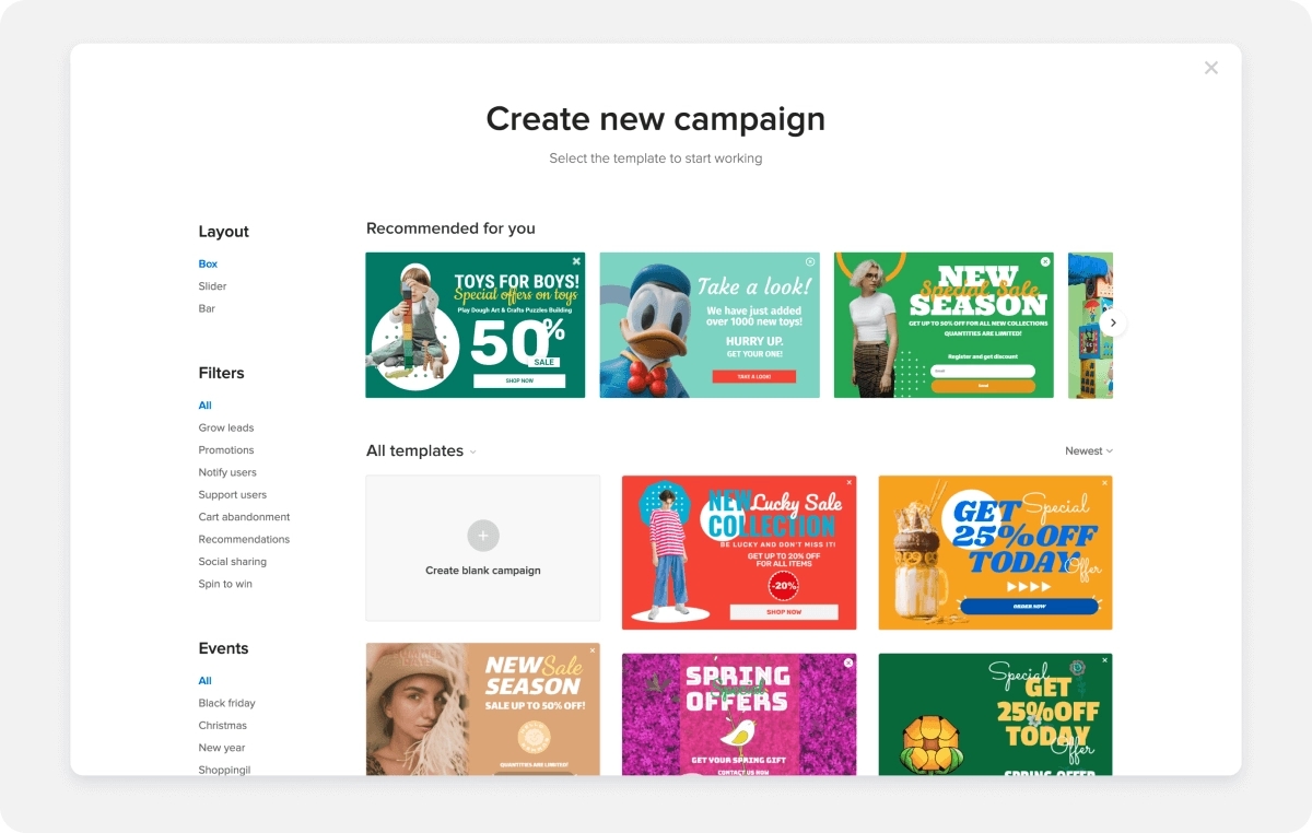
Case 1: Adoric’s campaign templates
Project: Adoric is a marketing SaaS that facilitates the creation and management of marketing campaigns on the Adoric website. Among other abilities, Adoric can scan each client’s website to create a generalized brand concept, including the preferred colors, fonts, and other aspects of their visual presentation. Moreover, it can scan whole domains searching for, say, ‘Black Friday’ or ‘Merry Christmas’ banners to give Onix’s designers the idea of the most popular colors and other trends.
A team of designers uses this data to create customizable banner templates that clients can use for their marketing campaigns. This service was intended to streamline new Adoric clients’ operations and, by increasing the effectiveness of their marketing campaigns, convince them to pay for a subscription. Simultaneously, users have the option to create their own banner from scratch.
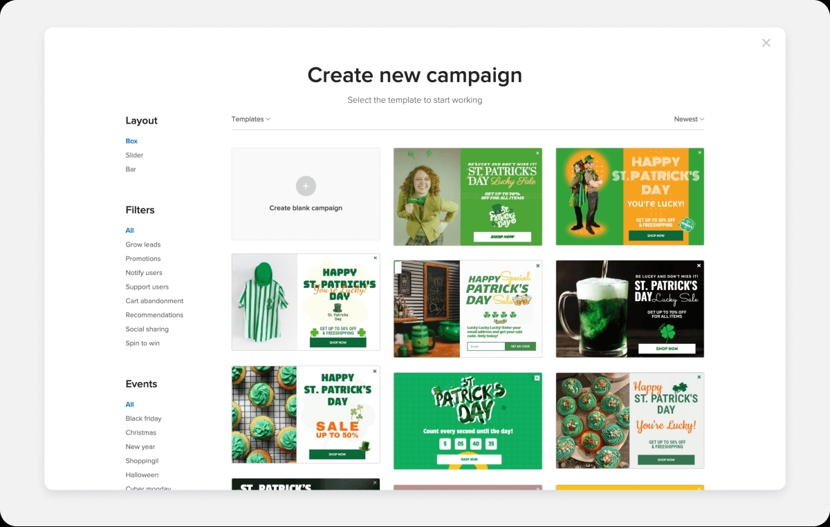
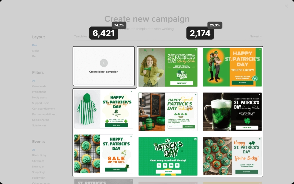
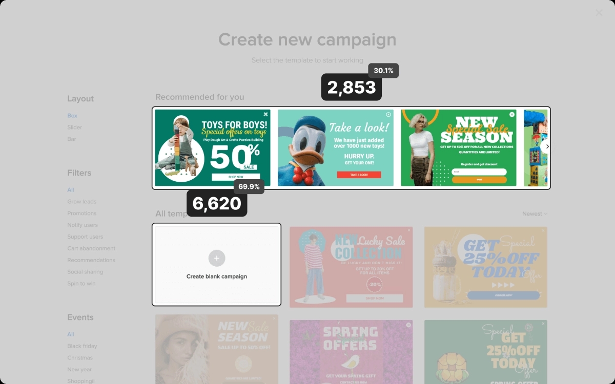
Problem: The product team identified a problem: despite the convenience and ease of using the ready-made templates, nearly ¾ of campaigns on the platform were still created from scratch.
Hypothesis: The design team assumed that the clients chose ‘blank campaigns’ because the available templates did not match their websites’ appearance.
Improvement: To provide clients with more suitable templates, the team suggested two possible solutions:
1) To apply the information about each client’s brand concept to the search for banner templates, i.e. search for matching colors and font styles in templates in the same language for the same industry.
2) To apply the information about each client’s brand concept to the search for banner templates, i.e. search for matching colors and font styles in templates in the same language for the same industry.
Result: The effort delivered tangible results. Over six months, the key metric — the number of used templates — increased significantly.
Case 2: Whistle.Live categories and search
Project: Whistle.Live is an online platform where users can host and attend various educational, entertainment, and other events for a fee or free of charge, subscribe to content creators, support them with donations, and more. The platform generates revenue through commissions from online transactions.
Problem: To increase revenues, the owner wished to increase the conversion rate: grow the number of users who buy tickets to online events. At that time, it was only 8% of all site visitors. It was assumed that such development would also increase the number of subscribers. Generally, the owner of the new service was interested in learning what was interesting for the audience.
Hypothesis: High exit and bounce rates may indicate that a page doesn’t contain the information the user was seeking or the available information is not easy to find or understand.
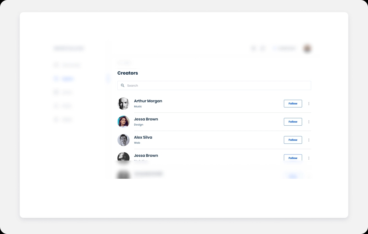
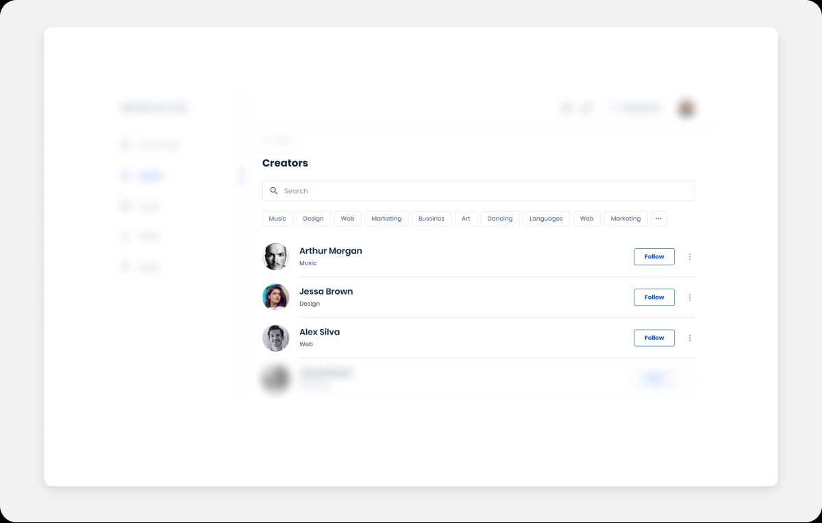
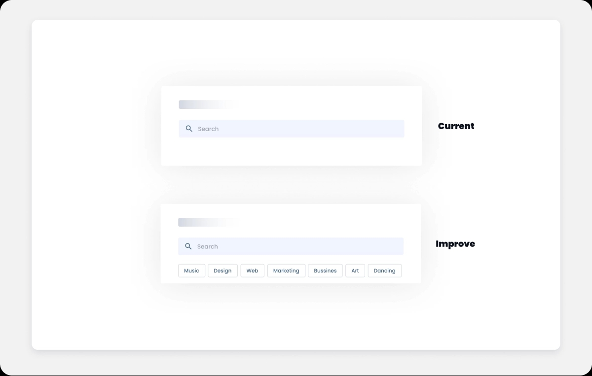
The team hypothesized that the user interface was the reason: the system did not indicate the creators’ skills, so the users had difficulty finding the right content among thousands of available videos and events from all industries. Searching for information could have been easier.
Improvement: The designer in charge suggested a solution: to improve the global search by filtering the event hosts and content creators by category (e.g., music, design, business, art, etc.). He assumed that a better organization of the available creators and optimized search might reduce both the task completion time and the bounce rate, which would positively impact the sales numbers.
The team set a goal: to increase the number of ticket buyers from 8% to 20% in a month. The number of subscribers (8% of users) should grow as well.
Result: In a month after the UX and UI design changes were introduced, the team accomplished the goal with flying colors.
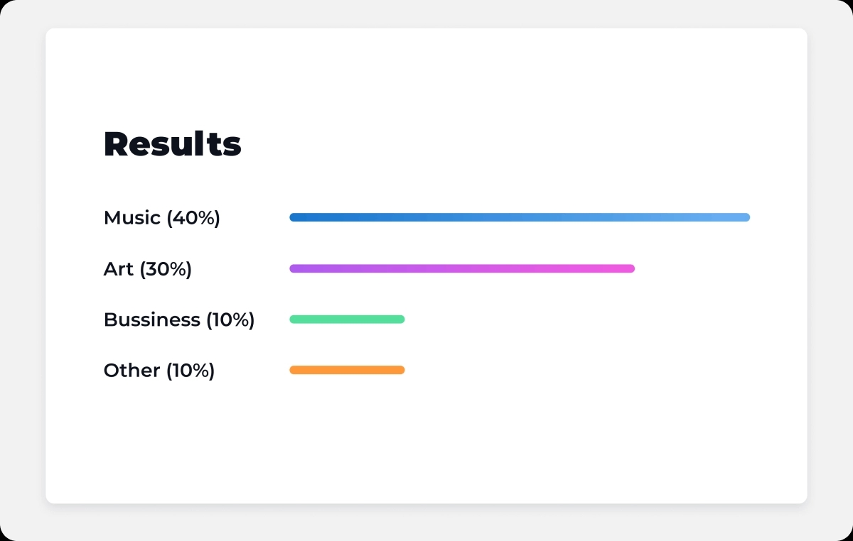
The segmentation of creators also provided valuable information about the target audience’s preferences.
Please don’t hesitate to contact Onix. Our experts can:


Let’s get started!
