Designing a platform for booking beauty services
Creating a compelling and user-friendly interface for a platform that transforms the way people book beauty services

How the Onix team designed a comprehensive platform aimed at helping people book beauty services provided by real professionals.
Beauty
Industry
3 specialists
Team size
USA
Location
3 months
Project duration


[ Business context ]
The client initially approached us with a request to replicate the structure of an existing service in the beauty industry. They wanted a platform that would follow a similar structure regarding functionality and features.
However, after conducting a thorough analysis, we identified that the user experience of the existing service could have been better. We decided to enhance the user experience rather than simply replicating the reference service.
Our approach aimed to balance meeting the client's initial request to mimic the reference service and surpassing their expectations by creating a more exceptional and user-friendly platform.
Thus, our expert design team was engaged to provide a comprehensive design solution from the ground up, leveraging best practices.

During the cooperation, the Onix team had several key responsibilities:
Conducting a comprehensive analysis of the project's requirements, goals, and target audience. Gathering information on the specific needs of customers and professionals in the beauty services industry.
Improving the existing poor UX and creating user flows that were intuitive and user-friendly.
Ensuring users could access the platform from their smartphones and tablets without issues.
Collaborating closely with clients to understand their needs and preferences, gather feedback, and make necessary adjustments to meet their expectations.

Want a custom design
for your product?

Mani serves two primary types of users
Customers | Professionals |
|---|---|
who are looking for beauty services | who are offering their expertise |
Solutions we provide
Our approach was centered on enhancing the user experience significantly. Rather than simply replicating the existing service, we aimed to improve it, focusing on making the client more satisfied. To do this, we followed a structured design process.


User Flow
Creating an efficient user flow was the foundational step. We meticulously designed the flow to ensure that customers and professionals could achieve their goals seamlessly.
The flow was tailored to cater to each user group`s needs and expectations.

Wireframes
Before delving into visual design, we developed wireframes to test and refine our ideas. This step allowed us to save time, clarify the layout and interactions, and ensure a smooth user experience.
Our wireframes comprised approximately 86 screens, providing a comprehensive foundation for the project.

Visual design
Our team focused on creating a visually appealing design that suited the beauty services domain. We emphasized the main components while also paying attention to the finer details.
The objective was to ensure that the interface element allowed users to accomplish their primary tasks.

Homepage
The homepage serves as the entry point to Mani. Here, we presented the proposed services, explained how the platform works, highlighted its main benefits, promoted skilled professionals, and informed website visitors about the availability of a mobile app alternative.
This page set the tone for the user experience and aimed to engage potential customers effectively.

User interfaces
Building upon the homepage design, we crafted user interfaces for the remaining pages.
This encompassed over 116 screens, various states, and elements, each carefully designed to provide a consistent and seamless experience.

Mobile-friendly design
Recognizing the importance of mobile usage, we ensured the entire site functioned flawlessly on mobile devices.
This responsiveness was crucial in meeting the demands of modern users who access services on the go.

Core technology stack we used
Figma prototype,
Figma,
Illustrator,
Photoshop
During the cooperation, the Onix team proved to be:
Innovative
Detail-oriented
User-centric
Meticulous
Efficient
Results
The Onix team successfully designed the Mani platform, creating a compelling and user-friendly interface for customers and beauty industry professionals.
By enhancing the user experience, we aimed to exceed client expectations and provide a design that met the requirements and offered a visually appealing and mobile-friendly solution.
Mani can potentially transform how people book beauty services, making it more convenient and accessible.

See other related projects


United Kingdom
Real Estate
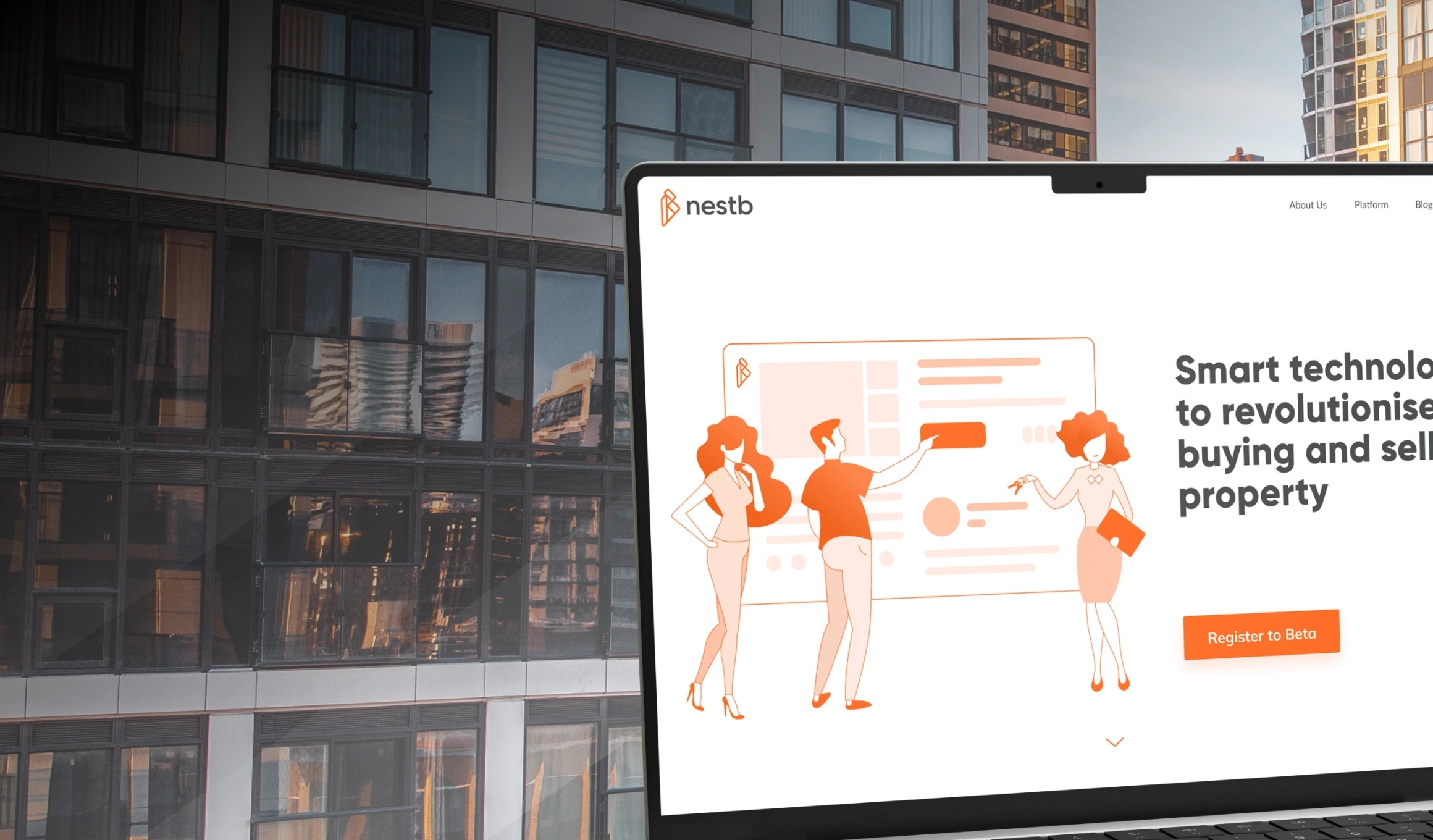
Nestb is a user-friendly platform to
revolutionize the property search
process
Brand identity and design for real estate business
Nestb is a user-friendly platform to revolutionize the property search process
Services provided:
We crafted a comprehensive brand identity & brand book, developed a user-centric homepage design for enhanced navigation to increase brand credibility


China
M-learning
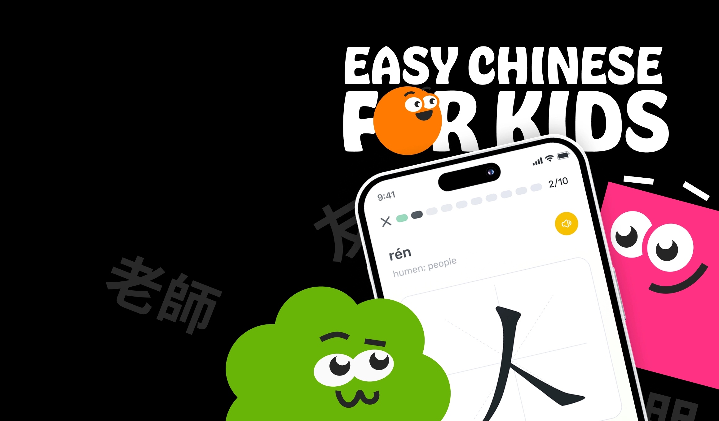
ChinEasy is a revolutionizing
personalized learning app with
interactive features
Brand identity design for chinese learning app
ChinEasy is a revolutionizing personalized learning app with interactive features
Services provided:
We offered full design services, including UX/UI design for mobile/web apps, brand identity, motion graphics design & creation of animated characters


Space
Motion design of a Hero Section
for a Space News website to optimize
performance
Space news portal with seamless brand identity
Motion design of a Hero Section for a Space News website to optimize performance
Services provided:
We provided full adaptive design services, from layout balancing, headline creation to glitch transitions, and brand identity for optimizing performance


