
SaaS Web Design Best Practices [+ Real-Life Case Study]


Anastasiia Bitkina
Content Manager
Website Design

Jul 14,202315 min read571 views
Are you going to design your SaaS website and need valuable tips on where you should begin? Or do you need a SaaS website redesign? In any event, this blog post is for you.
Based on our experience and real-life case studies, we share first-hand design tips and show you how to design not only an eye-catching but also a converting SaaS web design.
Purpose and target audience of SaaS designs
Web page structure
Web page optimization
Testing is a key
SaaS website redesign
How much does it cost to design a SaaS website?
5 best SaaS website designs for 2025
Conclusion
FAQ
We'll walk you through best practices for creating a great SaaS website design that effectively relays your company’s message through outstanding web design. Keep reading to learn some valuable information.
Purpose and target audience of SaaS designs
The primary purpose of any landing page is to convert visitors into leads. However, visitors will share their information only in exchange for something valuable. To create a compelling offer, you should answer the following questions:
- What stage of the buyer’s journey is this for?
- Which offer format will work best? E.g., free trial, online course, ebook, webinar, email course, etc.
- How will this benefit your target audience?
Any page may be a prospect’s first contact with a brand, so developing a clear buyer persona is essential before starting a design. The layout and content must be created with the target audience's preferences and expectations in mind: your customer should find the web page educational, engaging, and helpful enough to stay.
For exampe, when we worked on the design for Elastic, its marketing manager shared with Onix an idea of web design that should put their software as a service – an integration platform – center stage. The new page should simultaneously work as the SaaS website’s home page and landing for two types of prospects: IT professionals and less tech-savvy stakeholders.
The new design was intended to instantly expose the visitor to unique services offered by elastic.io while highlighting the ease-of-use.
Thus, our designers defined the key elements and requirements of the landing page design:
- introduction of the hybrid integration platform as a service via motion graphics that reflect the service’s high quality and the company’s positive approach to technology challenges
- trial request as the offer
- illustrations of service features appealing to both visitors who can code and those who cannot
- ‘softer’ look-and-feel with lots of air to emphasize the company’s culture of openness, transparency, flexibility, and support for the customers.
Web page structure
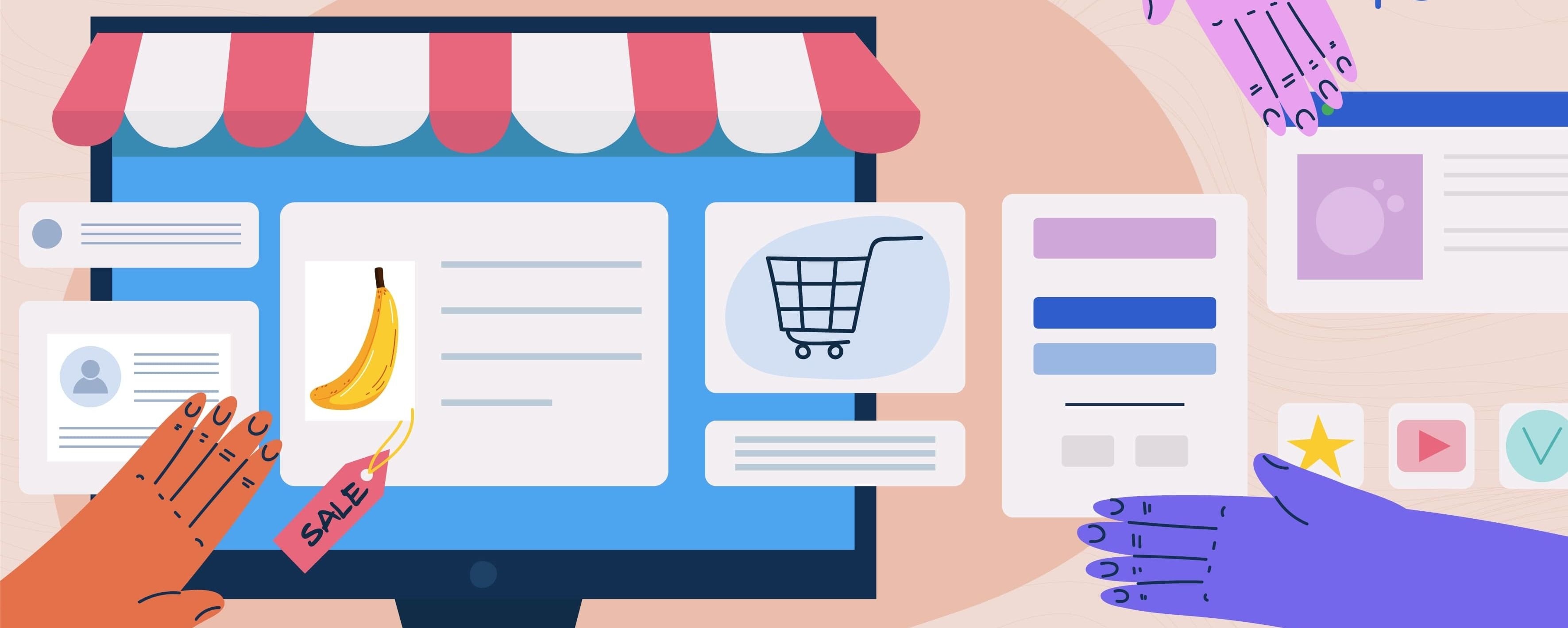
It appears that landing pages of most SaaS companies include at least several must-have elements:
- headline/value proposition
- call to action (CTA)
- lead capture form
- ‘hero’ image to present the site's most important content
- navigation bar
- social proof (customer logos or testimonials, awards, etc.)
- demo version
- scrollable content that gives the visitors additional information
- footer
The choice of the elements depends on each company’s business needs, but they still should be prioritized: the page layout and length (one screen or scrollable page) need careful consideration.
A visitor will not scroll down a page without a good reason (with the 8-second average attention span to boot!). It is thus essential to put the most valuable information above the bottom of the browser window as soon as the page loads.
In the case of landing pages, the most important elements would be the value proposition, call-to-action button or buttons, and a lead capture form (if any). If you want to provide additional information, a scrollable landing is a good idea, but ensure that only one logical segment or call to action is displayed on one scroll.
Here are some helpful SaaS design tips that may help you get the most out of your home page or landing:
Headline
100% of SaaS companies use headlines to promote their product. While summarizing your entire product, the headline should be short, compelling, and easy to read to instantly catch the visitor's attention. Before producing the headline, make sure you know your ideal buyer persona. Then, try to combine ‘what the business does’ and ‘what it does best’ into one sentence.
For example, for Elastic, we came up with a simple and elegant headline - ‘Hybrid Integration Platform’ - knowing that this rather understated value proposition would be complemented by an elaborate dynamic hero and a prominent CTA.

The hero
The hero element must impress the visitor when they land on your page. It may be a static image, carousel, animation, or a video designed to inspire emotion in your visitors, help them relate to your brand, and convey the emotional aspect of the headline.
More companies are now putting a video in the hero section: a 30-second video can explain a product much quicker than the words and pictures, as well as enhance the user experience.
Since the users are expected to watch the video before doing anything else on the page, the designers create oversized play buttons, screenshots that are actually auto-playing demo videos, and other techniques to attract and keep the visitor’s attention.
Many premium video hosting services offer analytics, so you will know how much content the visitor took in. Free services, such as YouTube or Vimeo, are available too. The video itself need not be expensive either: a computer microphone and screen capturing software may help you illustrate your product quite well.
Customer logos on landing pages seem to be a common social proof element with most B2B SaaS companies. Since elastic.io’s cloud-based platform connects various software applications, Onix designers decided to use this method in a slightly different manner: to integrate the most recognizable application logos into an explanation of the integration platform as a service.
Thus colorful logos were animated to ‘float’ around the headline and CTA. Their location implies there is more to see down the page. When the user scrolls, they merge with elastic.io’s logo, which further transforms into a ‘cloud’ image and then into Speed, Extensibility, and Elasticity - three primary customer benefits.

Call to action
Although the web page's top section should be as informative and bold as possible, the CTA(s) should still be clearly distinguishable. The CTA’s text, size, color, and location require special consideration. When choosing the color palette, ensure the layout elements are not too blended together: without the proper color contrasts, prospects may get confused when they arrive on the page.
Place the button where the mouse cursor naturally falls, next to an element that helps the user evaluate the offer before they click.
Below is an example of our designer’s work for SPOTIO, a comprehensive field sales management software for sales managers and reps.

The message in the CTA must be as short as possible, generally no longer than five words. The choice of words is also essential: rather than reflect the desired action, try to emphasize the reward. For example, ‘Get your Free Ebook’ is better than simple ‘Download Ebook.’ Create several CTA messages and test them to see which works best.
One more of our examples is the home page/landing of Elastic which includes two CTAs. Although both direct to the same form, their look and messages are different on purpose. The top CTA button was designed to stand out among the various application logos in the ‘hero’ section - and still, it pops out from the animated background seamlessly.
The second CTA is located close to the bottom of the web page, after multiple sections of the SaaS feature descriptions and pictures. The button was intended to re-capture the visitor’s attention after all the scrolling and to remind them about the goal - requesting a demo. Another animation provided an elegant solution for it:

Lately, SaaS companies have been including one or more form fields alongside the call to action, so generally, the user enters at least their email before clicking. It’s helpful in two ways:
- If the next step after the home/landing page is a giant form, the drop-off rate will be high. Adding a little bit of friction up-front removes some from the second step.
- If the user abandons the process afterward, the sales team still gets a well-qualified lead who initially intended to sign up.
If you place a whole lead capture form front and center on the page, remember that it is the most critical part of generating new leads. The design must convince the visitor to enter their information in the form. Invest your time, creativity, and energy into developing non-standard user-friendly forms.
Prospects, especially first-time visitors, are very protective when it comes to giving out their personal information in a lead capture form. Include a link to your privacy policy to put them at ease. It is also crucial to ask the right questions.
Ask your sales team what information they need to guide leads through the funnel, and try to reduce the number of questions further. Neil Patel claims that he boosted the conversion rate on the eponymous website by 26% just by removing one field from the сontact form!
Navigation bar
A navigation bar is essential for the home page. It may also prove helpful on landing pages if you want to give the visitor the ability to find out more about the software, SaaS pricing plans and company before clicking the CTA. (In that case, make sure to place the CTA on each page of interest.)
Other content
They say that in matters of engaging SaaS customers, ‘content is king’ and must be given first-class treatment during the website design stage.
SaaS buyers are receptive to numbers: they like facts, statistics, metrics, and graphs. Include such information and eye-catching pictures demonstrating that your software is useful, customizable, and easy to use. Here’s an example:

Make sure your visitors can skim and scan the page easily. Highlight key points with headings, bold/italicized text, bullet points, etc., utilize fonts that can be easily read on any device or browser, and add neutral background and white space.
Take a look at elastic.io, where users can view a short description of each feature of the product alongside its screenshots:

Some visitors will want to try a product without signing up for a trial immediately. First-time visitors should be able to access your demos within a few minutes of entering your site. Generally, demos are best served when they are just a click away.
Social proof
Social proof may include, but is not limited to
- customer logos
- feedback from happy customers
- links to customer stories and/or videos
- links to case studies
- company awards
- social media buttons, etc.
These elements are usually placed on secondary locations, a landing page, or separate pages. However, since the SaaS business model is known to lack somehow the ‘human factor’, which may scare away some visitors, in some cases, it may be reasonable to show them a fellow customer as a ‘hero.’
Some more tips:
- If you are putting customers’ stories and feedback front and center, select those customers that match your ideal buyer persona.
- If you want to show off your customer logos, make sure the logo cluster looks neat and complements your landing page's design.
- Some company logos may work as links to rich customers’ stories or even videos.
Contact information
You may also increase conversions and sales by enabling visitors to find your contacts easily on the landing page, ideally without even looking for them.
Typically, contact information is located either at the top or bottom of a web page. Wherever you decide to post yours, make it visible and clear. Also, invite the visitors to follow the SaaS company on social media and add social sharing links and buttons.
Web page optimization
Landing pages are one of the core SaaS components of inbound marketing. SEO still plays a huge role in page ranking for a home page. To realize a SaaS web page’s lead generation capability, apply the following best practices:
- Research long-tail keywords to use for your landing page
- Include your keywords in the landing title, headers, URL path, and content
- Include alt tags for your images
- Add social share buttons
A well-designed and SEO-friendly home and landing pages can help your SaaS business overcome marketing challenges.
Testing is a key
Trends and users' demands become obsolete quickly, so you should react with lightning speed. Testing is a must to surely know what works best for you and what doesn’t, and A/B testing is perfect for this goal. You can compare two versions of your SaaS website design and decide which one performs better.
Testing is a culture, and you should embrace it frequently and regularly. There are the key points you should monitor and test to have excellent efficiency and high conversion rates:
- Value proposition on the homepage
- Homepage flow
- Call to action
- Demo/Trial/signup points
- Email subject lines/body text
These valuable insights allow you to understand what users do on your landing page, what they click, what they skip, and don't like. Moreover, today everything is changing at breakneck speed, so regularly collecting data and analyzing it to keep your SaaS design up-to-date will be a positive habit.
SaaS website redesign
Most SaaS companies need to redesign their website to improve performance, draw more traffic, and increase conversion rate.
One more reason is rebranding. No matter why you decided to redesign your SaaS website, you should understand this process implies not only changing and updating visuals, content, and so on but also deep research and thorough analysis.
Below we share the critical steps you should include in your SaaS website redesign strategy.
- Analyze your existing SaaS website metrics. Before redesigning a website, it's better to analyze your current performance metrics (bounce rate, number of visitors, website traffic, time on site, etc.) to have a better picture of what to pay attention to.
- Clearly define your redesign goals. To achieve good results, you need to set clear goals from the very beginning. Your goal should be as specific and measurable as possible.
For example, you want to increase your conversion rate, decrease your bounce rate, and, as a result, boost your overall sales. It sounds more like a plan than "I need a website redesign because we haven't changed anything in a while."
- Reconsider your company’s message. Perhaps with the updates in SaaS website design, your branding and company’s message have also changed. Before making any design changes, review your unique value proposition and content that promote your product to make your website look and feel consistent.
- Review your target audience. Any successful product is created with an end-user in mind. With changes in branding and design, your target audience may also change. So you should thoroughly learn about the target audience and identify users’ needs. This in-depth research allows you to clearly define your buyer persona and create a website that speaks to your visitors in their language, showing that you know their pain and offering a great solution.
- Test and collect feedback. When you implement new design solutions, it's vital to analyze them and optimize them if needed.
For example, we use Hotjar to understand how users really experience our design solution. Using Heatmaps, we examine what is and isn't working with our images, text, etc.
And when a product prototype is ready, we implement and analyze the analytics. Web analytics enable us to collect, measure, and analyze web data to know what to optimize for website effectiveness.

Learn how Onix helped build a straightforward SaaS product for setting up marketing campaigns
How much does it cost to design a SaaS website?
To calculate the SaaS web design cost, first, you need to consider the top influencing factors that make up the overall cost of SaaS design. The most important of them are the following:
- Your project size. This point includes the number of modules available in the product, the number of screens, and pages. For example, designing and testing a SaaS website with 50 screens, various pages, and advanced features is more tedious and time-consuming than a simple SaaS project with 25 screens.
- SaaS design complexity. This implies the product logic, the number of functionalities, and their complexity. Moreover, if you need a custom design (icons, typography, etc.), it requires more time and costs.
- The design team location. The company rate is the most important factor that significantly impacts the design cost.
The design service rates may vary depending on the country where the designers are located. You can compare the average rates of web design agencies on Clutch. For example, the hourly rate for a SaaS website design company in Ukraine is $50-100. While US design companies' rate is $150-200.
To calculate the final price of your SaaS web design, we need to know your project requirements, its complexity, the tools required, and many more determinants. If you want to know the exact cost to design a high-converting SaaS landing page, discuss your idea with our experts, and we'll calculate your SaaS web design costs.
5 best SaaS website designs for 2025
Our designers at Onix have been providing design services for over 20 years, so they know what patterns work best. Below we've singled out the five best SaaS web designs to illustrate our ideas with some good examples.
MailChimp
MailChimp is another example of good SaaS web design. It's striking and vibrant enough but at the same time minimalistic and straightforward. The homepage flow flawlessly demonstrates the key features of the product using excellent and memorable illustrations. Its landing page is both simple and dynamic.

Dropbox
This is a vivid example not beating around the bush. Dropbox states its main value proposition clearly and succinctly. What is more, they reinforce the homepage with a video to explain their product features and increase time on the page.

Slack
This cloud-based team collaboration platform is an excellent example of simplifying page navigation paired with quick animation and concise copy. The homepage provides a solid flow for conversions prompting visitors to try the product for free or start quick registration.

SEMrush
SEMrush is a great example of combining plenty of white space with splashes of vivid colors for highlights. The homepage has clear paths to conversion using a CTA and crystal clear copy that explains the nuts and bolts of their product.

Conclusion
The creation of any website requires an understanding of the future users’ needs, well-thought-out content, web design, and testing, but the task is particularly tricky for software as a service (SaaS) companies. Moreover, competition in the market is tough and fierce, so SaaS companies set the bar extremely high for their home and landing pages.
Although there is no rule of thumb for a successful SaaS website design, in this article we tried to list best performing UX trends and illustrated some with examples from a recent project of Onix.
Do you need an eye-catching and converting SaaS web design, or do you wish to redesign your SaaS to increase efficiency and conversion rates? Onix can help with every stage of designing SaaS. If you have any questions or need a consultation, please feel free to contact us.
FAQ
What are the main steps to design a SaaS?
Our designers go through these critical steps to create a great SaaS web design:
1. Project discovery
This is the time when our UI/UX designers collaborate with our customers to conduct a research and task audit. At this stage, we define what problem we want to solve and for whom and what the product vision is.
This is when our UI/UX designers collaborate with our customers to conduct research and task audits. Our project discovery services help define the problem we want to solve, for whom, and what the product vision is.
2. Research
Any successful product is created with an end-user in mind. So at this stage, we thoroughly learn about the audience and identify users’ needs.
3. User flow
Based on the outcome of the research, we prepare a representation of the user’s interactions with your product.
4. UX wireframes
Our designers turn ideas into concrete examples. Wireframing enables our designers to demonstrate an essential representation of your product. This stage provides a clear visual structure and introduces important features and navigation.
5. Prototypes
We critically evaluate the concept and UI presentation. Prototyping puts us one step away from crafting a real product design users will enjoy and consider handy and friendly simultaneously.
6. Design system implementation
Our designers create stunning visuals and deliver a scalable design system to keep the product's look and feel consistent.
7. Usability testing and collecting feedback
We use Hotjar to understand how users really experience our design solution. Using Heatmaps, we examine what is and isn't working with our images, text, etc. This analysis allows us to optimize our UX.
Learn more: How Onix’s UX audit identifies key usability improvements to enhance your SaaS product’s user experience.
8. Web analytics
When a product prototype is ready, we implement and evaluate the analytics. Web analytics enable us to collect, measure, and analyze web data to know what to optimize for website effectiveness.
9. A/B testing
Based on analytics, usability testing, and feedback, we build hypotheses for improving UX and test them.
How to choose a SaaS website design company?
To make the right choice and hire a reliable SaaS website design company, it's wise to pay attention to important factors such as portfolio, relevant expertise, experience, location, previous clients' feedback, etc.
Moreover, to choose the right company, you can talk openly with their specialists to ensure they understand your problem and know how to solve it with modern and reliable technologies.
How much does it cost to create a SaaS web design?
SaaS web design costs may vary on various factors. To accurately answer this question, we need to know your product idea, its complexity, and the number of required features and screens. You can share your idea with us, and our experts will calculate your design costs.
Do you have examples of your SaaS design work?
Sure! Here you can see how Onix provided effective design solutions for the SaaS platform that resulted in an increased number of leads. And this case study demonstrates how the Onix team transformed our client's SaaS idea into a beautiful design.
Written by:
Effective product management and development. Aligning an organization's technologies to the needs of the business.
Anastasiia Bitkina
Content Manager
Related articles
Website development
How to Build an eCommerce Website (Timeline & Costs)
Find answers to key questions about building a custom e-commerce website, online store, or platform - from features and tech stack to cost and timeline.
Denis Sheremetov
Apr 28,202323 min read734 views
SaaS Dev

Сustomer churn rate: What it is and how to calculate it?
A complete guide on how to calculate the customer churn rate. Explanation of the formula and consideration of key examples of the KPI. Learn also about measures to reduce customer churn.
Serhii Kholin
Apr 24,202314 min read300 views
SaaS Dev
SaaS Software Development: Components & Cost
If you are thinking about starting a SaaS business, here you can learn about the key SaaS components and the approximate cost of developing a SaaS platform.
Serhii Kholin
Jan 11,202414 min read283 views
Website Design

Top 7 Web Design Mistakes Small Businesses Make
For a small business, web development and design done right are investments in growth. Learn about some mistakes that can harm your brand and goals!
Serhii Kholin
Jul 24,20235 min read301 views


Join us now and get your FREE copy of "Software Development Cost Estimation"!
This pricing guide is created to enhance transparency, empower you to make well-informed decisions, and alleviate any confusion associated with pricing.
In this guide, you'll find:
Factors influencing pricing
Pricing by engagement type
Price list for standard engagements
Customization options and pricing
Pricing by product
